![]() Observation
Observation
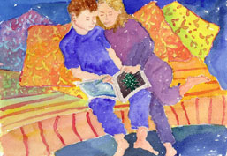 This watercolor painting has been submitted by artist Anne Davis.
The craft and techniques used in this painting are great. The colors are vivid and the style is relaxed and loose.
The painting is beautiful as it is, but my suggestions for further experimentation are to add more depth and values to the painting which would improve the balance of colors.
![]() Adjust the color balance and value
Adjust the color balance and value
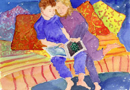 First, I'd deepen the colors of the two pillows (roll your mouse over the image to view these areas) on the left and right of the two people.
I'd apply a layer of red on the pillow on the right, then I would mix red and burnt sienna to wash on the pillow on the left. This would tone down the area next to the main subject, the people, while at the same time adding stronger value and visual variety to the whole painting.
![]() Enrich the neighboring colors
Enrich the neighboring colors
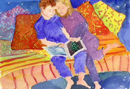 I would want to push the colors more in the direction of this unique style. Still working to the left and right of the figures, I'd make the horizontal red strokes brighter (roll your mouse over the image to view these areas), which adds more contrast with the background as well as the figures.